Analytics Logo CS

Show Progress for ALL Pupils in your Primary School

Primary schools are often unable to show progress or analyse data for pupils with SEND. There are different ways to demonstrate progress and for pupils with SEND, this starts with smaller steps, but also includes the ability to show progress across different levels/steps/stages at the same time. Too many systems are limited to only showing progress on one level.

Pupils with SEND often don’t learn in the typical order, they have strengths, but also areas where they need additional support. When you look at progress on only one level, you will only be focusing on the areas they need additional support, not the areas where they shine. To understand pupil progress, we need to look at ALL the progress pupils are making.

To reduce workload and costs for primary schools, we have developed our assessment software Connecting Steps to work for ALL pupils. As well as our assessment frameworks for pupils with SEND, we have created 2 new frameworks (Development Matters and Primary Curriculum) to allow Connecting Steps to be used quickly and easily in mainstream primary schools for pupils working at Age Related Expectations.

Our Analytics Platform allows schools to combine the data for SEND and non-SEND pupils into a single data set automatically, so you can analyse progress across your whole school.

One System

B Squared have created a wide range of frameworks for different curriculums in different countries. Our analytics platform provides a consistent format for data for pupils of different ages and abilities.

When looking at data you can use each frameworks own level structure or you can use our standardised score. The standardised score is a universal scoring system that can make understanding data simpler when using multiple frameworks for different pupils.

Easy to Use

Our analytics platform comes with over 20 different base reports than can be customised to suit your needs. Each report can be customised with filters, different views and a variety of options. You can pin the reports you use the most or you can use favourites to customise and re-use reports.

Our FREE unlimited support is always here to help you get the most out of the Analytics platform.

Effective Data

Our flexible grouping and the ability to show progress in a range of different ways means you can get more out of your data. You can show progress across multiple levels. You can compare progress between the current year group and previous year group. You can look at progress made across different school years for a group of pupils. You can choose the level of detail and the type of report that best shows the progress your pupils make.

Want TO MAKE DATA ANALYSIS EASIER?

Click on the button to arrange a FREE online meeting to find out how we can help make assessment and data easier for your school

Don’t be Scared of Data

The B Squared Analytics Platform has been designed to be used by anyone. There is no need to spend hours in Excel, you do not need to be an Excel guru. Each graph can be generated with only a few clicks. You can then play with the report by filtering and sorting the data. You can use the different views and options to gain even more insight.

For years schools have relied on a single person to build their data. Now middle and senior leaders can access the data themselves quickly and easily. They can find their own answers to their questions.

Users can personalise the experience by creating folders of favourite reports. Termly reports can be customised and saved for future use. Producing the next set of termly reports should only take a few minutes.

Sometimes schools don’t know where to start when looking at data. They don’t know how to analyse data. We have recorded some webinars to help schools get the most of their data. Click on the button below to watch our ‘Analysing Data for Pupils with SEND’ Webinar.

Analysing data for pupils with SEND webinar
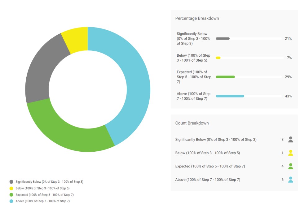
Analytics pie chart

Easy to Understand Data

It is easier to understand data when it is presented correctly. We have a variety of different graphs in the Analytics platform including Donuts, Column Graphs, Line Graphs and Radar Reports. You can choose the way to share data that makes sense to you and gives a clear picture. The easier data is to understand, the more the data can be used to make changes.

Choosing the right way to present data makes a big difference.

Clearer Data Analysis

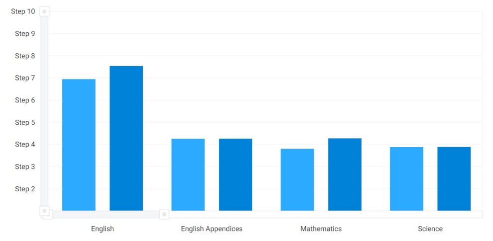
Most systems that create graphs for school treat levels as all being equal. They are not. In most frameworks/curriculums there are different sized levels. Our standardised score converts progress within the different levels into a standardised measure. This gives you a fairer way to look at your data so that you can make better decisions.

The standardised score also makes sharing and understanding data from different frameworks/curriculums easier. You don’t need to explain the different level structures, you can use a simple scoring system for all data, making the data more accessible.

B Squared’s Analytics Platform analyses data in a fairer way that is easier to understand.

Analytics graph

Target Setting

Schools have set end of year targets for years. Many believe this is something that supports schools and helps pupils to achieve. There are a number of issues around this, especially for pupils with SEND. Who sets the targets? Where do the targets come from? How are targets reviewed?

Target setting is one of those “We have always done it this way” processes that schools follow. Schools need to review this process and ask themselves why are they setting the targets and what is the impact? Click on the button below to watch our webinar on “Target Setting for Pupils with SEND” and download our guide on target setting for pupils with SEND.

Effective target setting for pupils with send webinar

Want TO MAKE DATA ANALYSIS EASIER?

Click on the button to arrange a FREE online meeting to find out how we can help make assessment and data easier for your school